 Bull Teknoloji's SHIELD
A Trading Risk Tool that cut an alert's response time by 80%
Impact at a Glance
The Problem
What is High-Frequency Trading?
Imagine a trader making 10,000 buy and sell decisions per second — faster than you can blink. That's high-frequency trading (HFT).
The Old Way: Manual Risk Monitoring
Before SHIELD, risk managers monitored trading using a Pre-Trade Risk Management (PTRM) system provided by Borsa Istanbul — Turkey's national stock exchange and the platform that all member trading firms are required to use for pre-trade risk compliance.
The BISTECH PTRM system was designed 15 years ago and never updated for modern trading volumes or team sizes:

The BISTECH PTRM system used by all Borsa Istanbul member firms — dense, fragmented, and built for a different era
The Risk Manager's Response Loop
Every second after a limit breach matters. SHIELD was designed around this exact four-step loop — so risk managers can move from alert to action without switching tools or losing context.
Notice
Critical alerts first
Alerts dashboard
severity-sorted
Understand
Full context, one click
Detail side panel
who · what · which rule
Locate
Straight to the scope
Hierarchy explorer
group · account · user
Act
Adjust the limit
Limits editor
usage visible inline
Live order monitoring page
Before & After SHIELD
Before designing anything, I sat with the people who'd use it.
My biggest advantage was direct access to real users. Our sister company, Liquidity Trading, is an active trading firm working in the exact environment I was designing SHIELD for.
What I did
Click a card to expand
Research Files
Click a file to preview it
Collaboration with Engineers
With features being built in parallel, we used a mix of async and sync communication — keeping engineers unblocked between meetings while staying closely aligned when decisions needed a real conversation.
Our Communication Stack
Click any card to expand
Why it worked: Engineers got context without waiting for meetings, and I received technical feedback faster.
SHIELD's Four-Level Hierarchy
Every trading firm has a complex organisational structure. SHIELD mirrors this with a four-level hierarchy so risk managers can set limits at exactly the right scope. Click any level to expand.
Solving Complex UX Challenges
Throughout the design process I had to make some key UX decisions. Here are two of the trickiest ones.
Visualising Map Attributes for an Alert
The Problem
The engineers gave me a SQL sheet which I analysed and found that each alert row can have between 8–10 map attributes. They were too many to add as separate columns, and would be cluttered under one. There was also a possibility of these attributes increasing in future versions.

My Solution — Step 1
I decided not to add them to the alerts table but show all map attributes when the alert row is clicked. This led to a second question...
Accordion or Side Panel?
Should the map attributes be shown in an Accordion or Side Panel when the row is clicked?

Final Decision — Side Panel
Keeping the alert details visible in a side panel while still being able to scroll through other alerts to compare was more important for users than saving horizontal space.
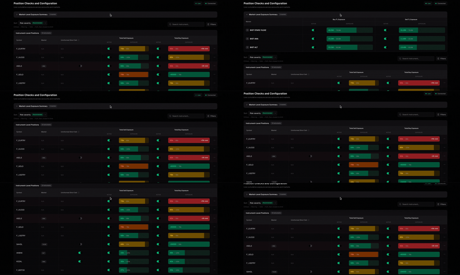
Too Many Empty Columns on the Positions Page
The Problem
We had one table for markets (top 3 pinned rows) and positions (remaining rows). Some columns like Buy/Sell Quantities weren't relevant for the top 3 rows, and Buy/Sell TL Value weren't relevant for the rest — making horizontal space very inefficient.
Before

After
My Solution
I split the tables in two — reserving the top table for markets with a collapsible option, making more space for the instruments table below. This made much more efficient use of horizontal space.
Building the Interface
I made initial designs in Figma, then screenshotted and exported them into v0 for fast prototyping — our features were being built in parallel in the backend, so the team constantly needed to see different prototypes.
Once we agreed on a flow and structure I'd reimport back to Figma to finalise and polish. The frontend developer would use the v0 code and Figma design as a reference to implement.

Claude Usage for Design System
I connected Claude to Figma MCP to speed up my design process, and created a light mode kit with Claude's help.

Design Principles
Click any card to see it in action
Why These Colors?
Orange (Primary)
Bull Technology's brand color — carried through into SHIELD as the primary action and highlight color.
Dark Backgrounds
Reduces eye strain during 12-hour trading sessions.
Green / Red
Universal trading signals — profit/loss, safe/danger.
Blue Accents
Trustworthy, calm, professional.
Where is SHIELD Now?
SHIELD launched in July 2026, and our clients have started using it in production.
My team and I are now iterating on v2, working through a backlog shaped directly by their feedback.
Launched
July 2026
Status
Building v2 from client feedback
The Impact
Measured live with traders — we timed how long it took to spot an alert, open the side panel, identify its source, and begin analysis. Average dropped from 3 minutes on BISTECH PTRM to 12 seconds on SHIELD.
SHIELD consolidates everything into one platform — real-time alerts, positions tracking, order monitoring, and setting or removing risk limits. Tasks that previously required 3–4 separate tools, each with its own interface to learn.
After shipping the MVP, we ran a week-long testing session with the trading team at Liquidity Trading, our sister company. When we reconvened, they told us BISTECH PTRM took a couple of weeks to get comfortable with — but with SHIELD's clear navigation and clean UI, they were fully up to speed in 3–4 days.
Reflection
Check out other projects


